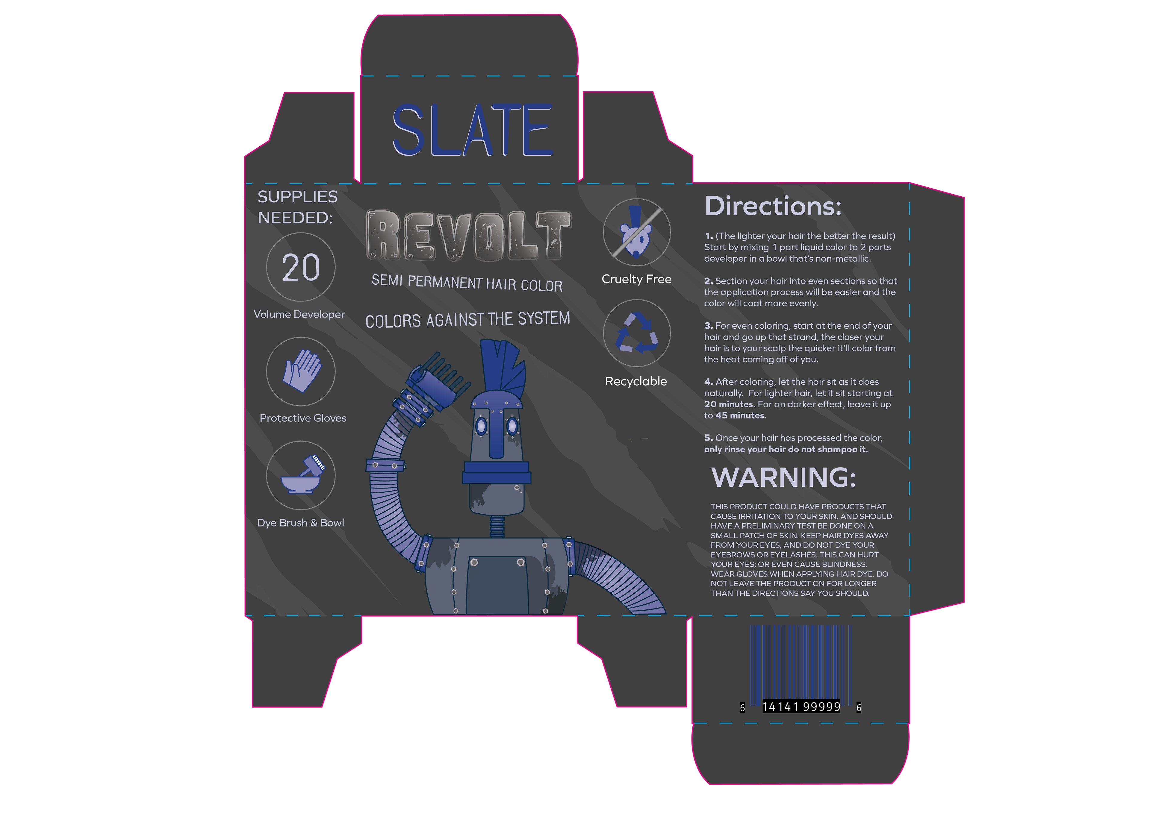
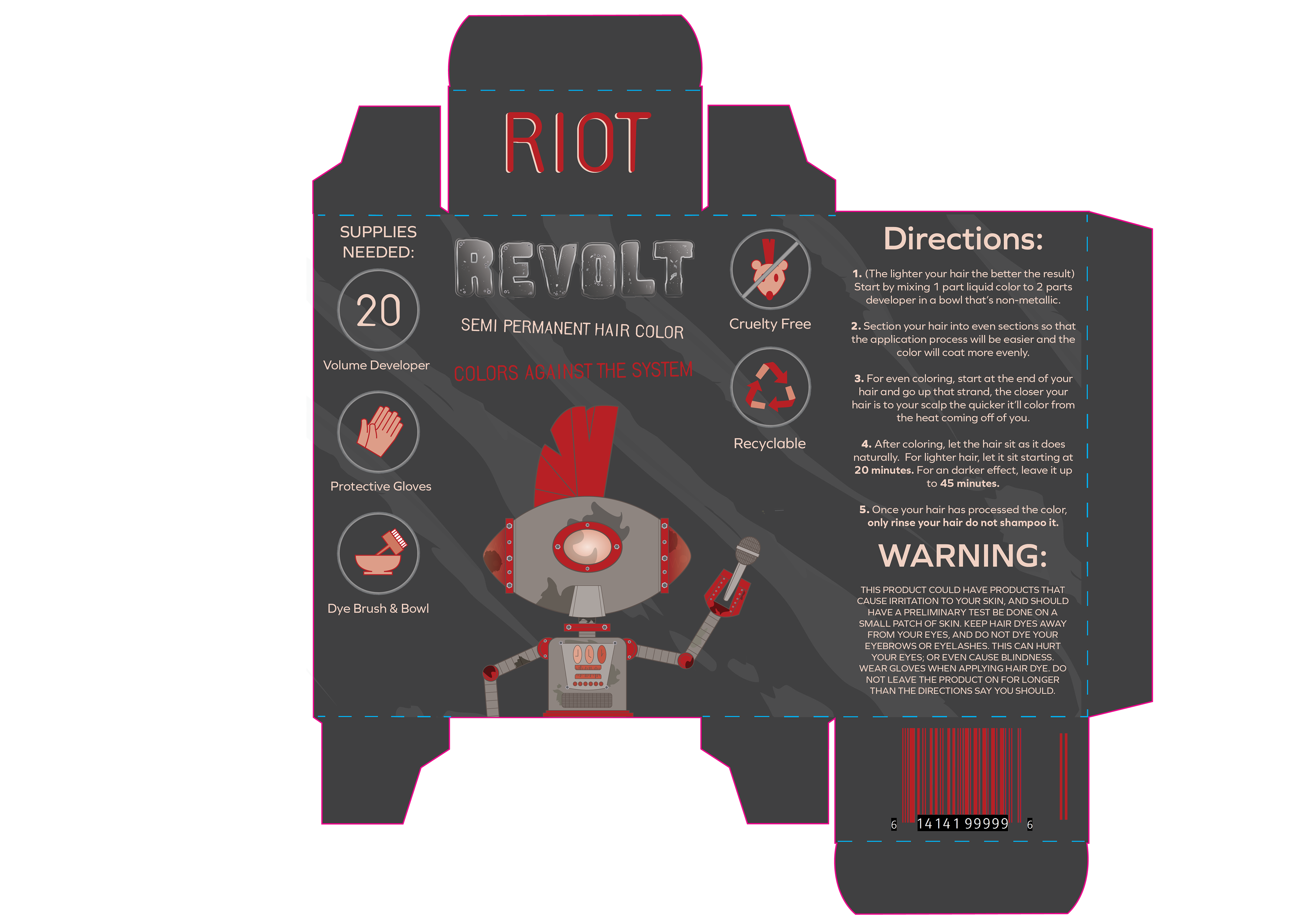
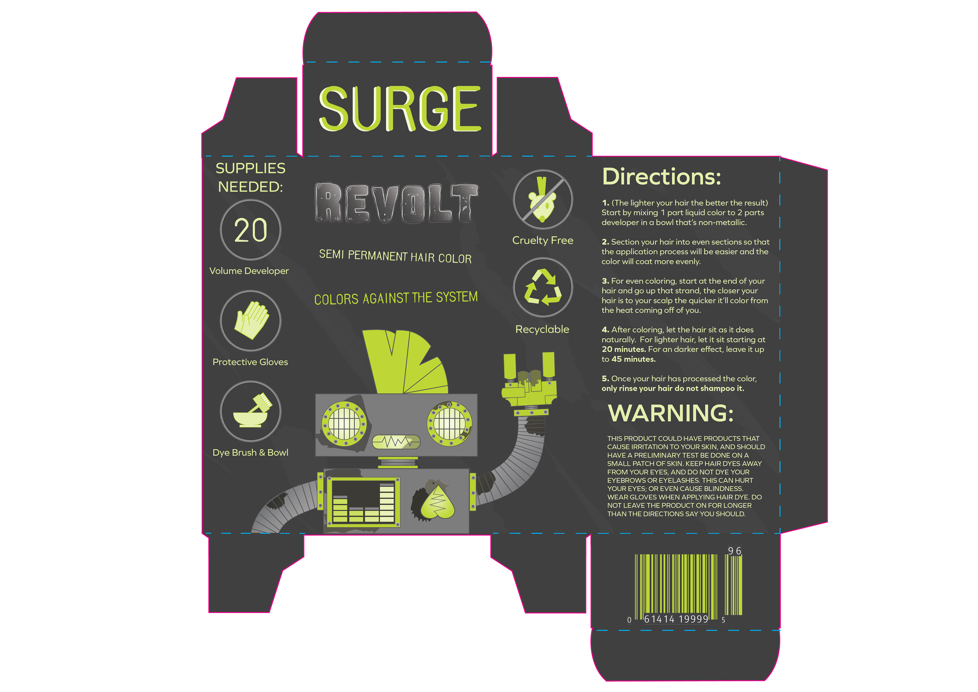
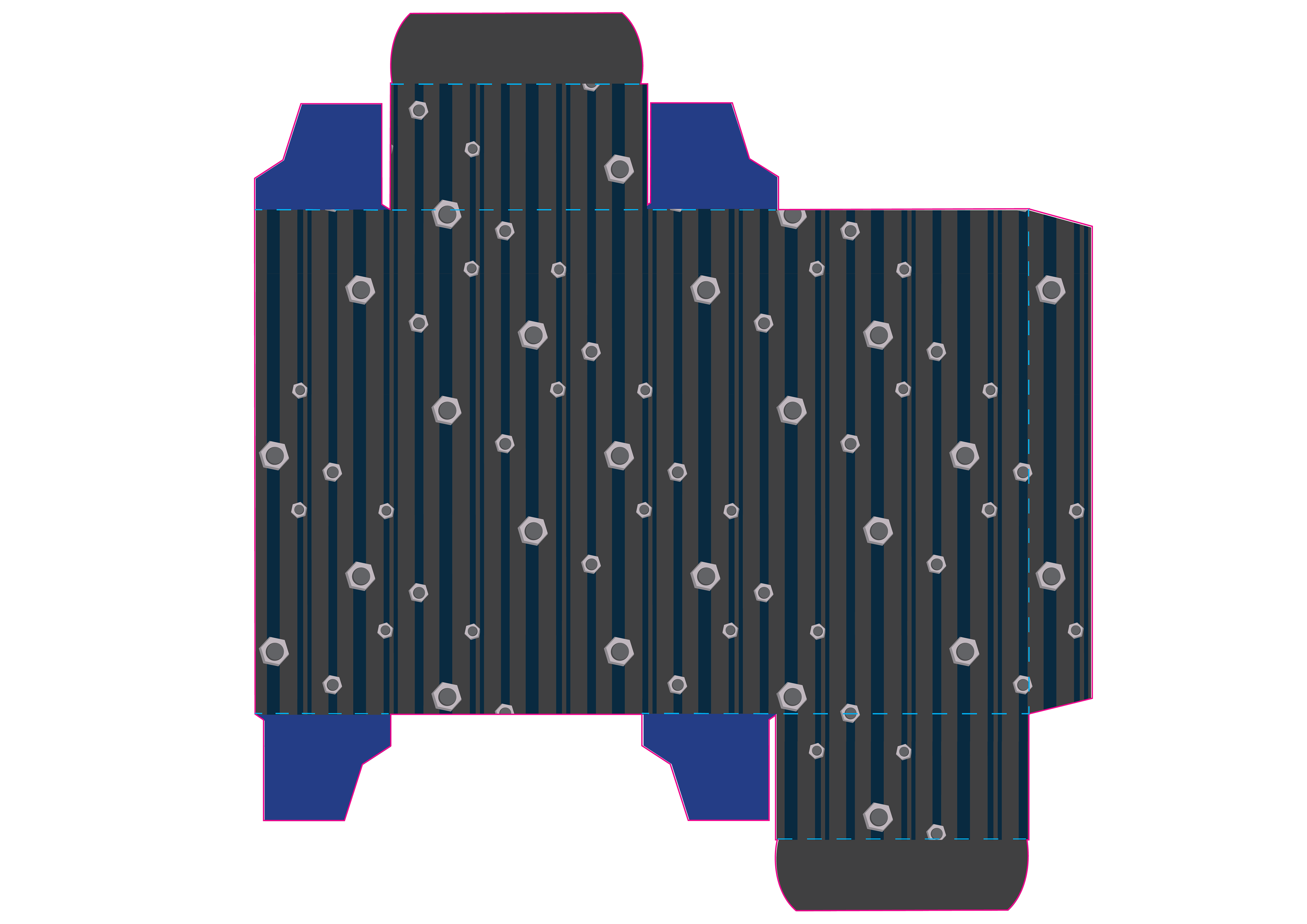
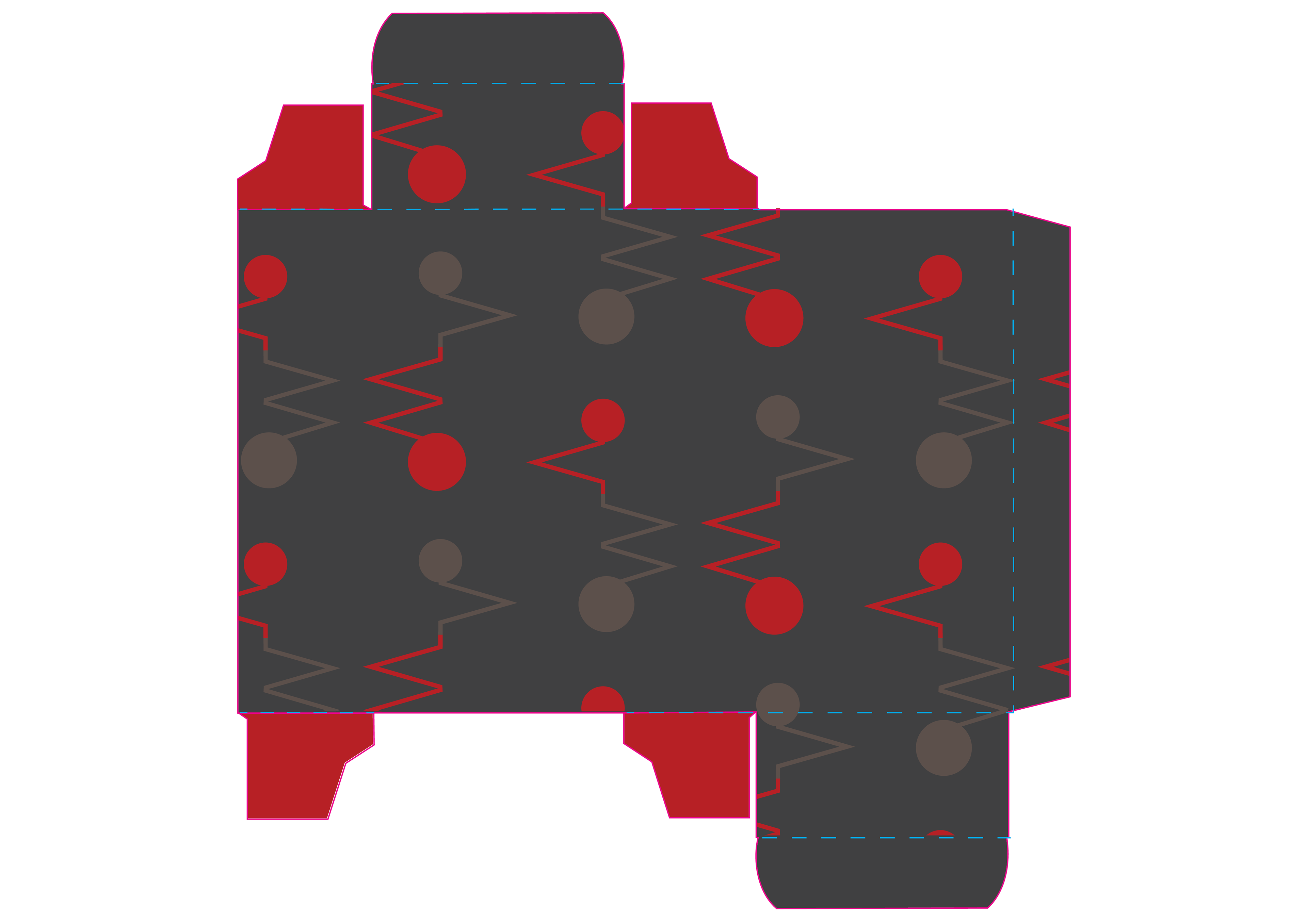
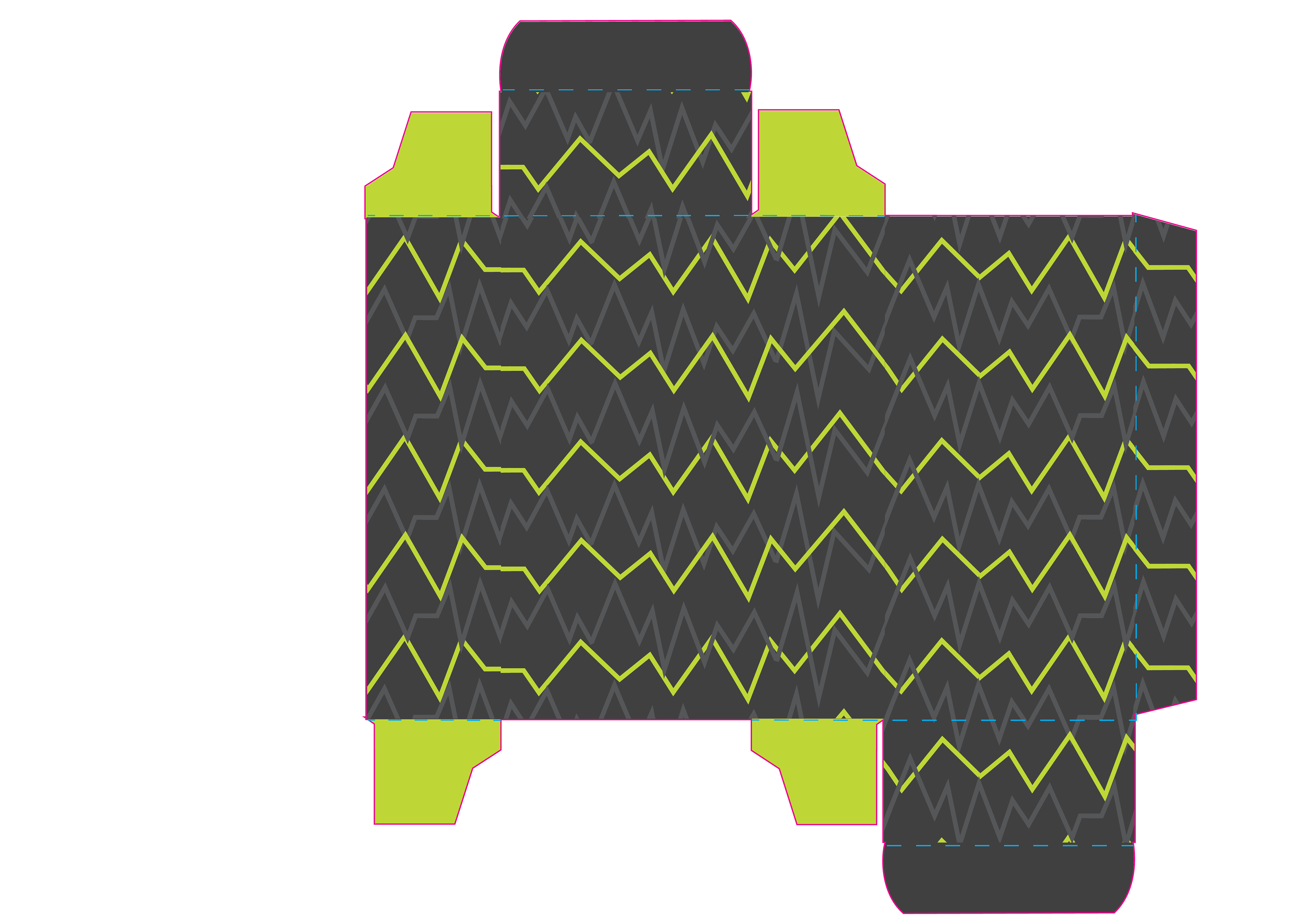
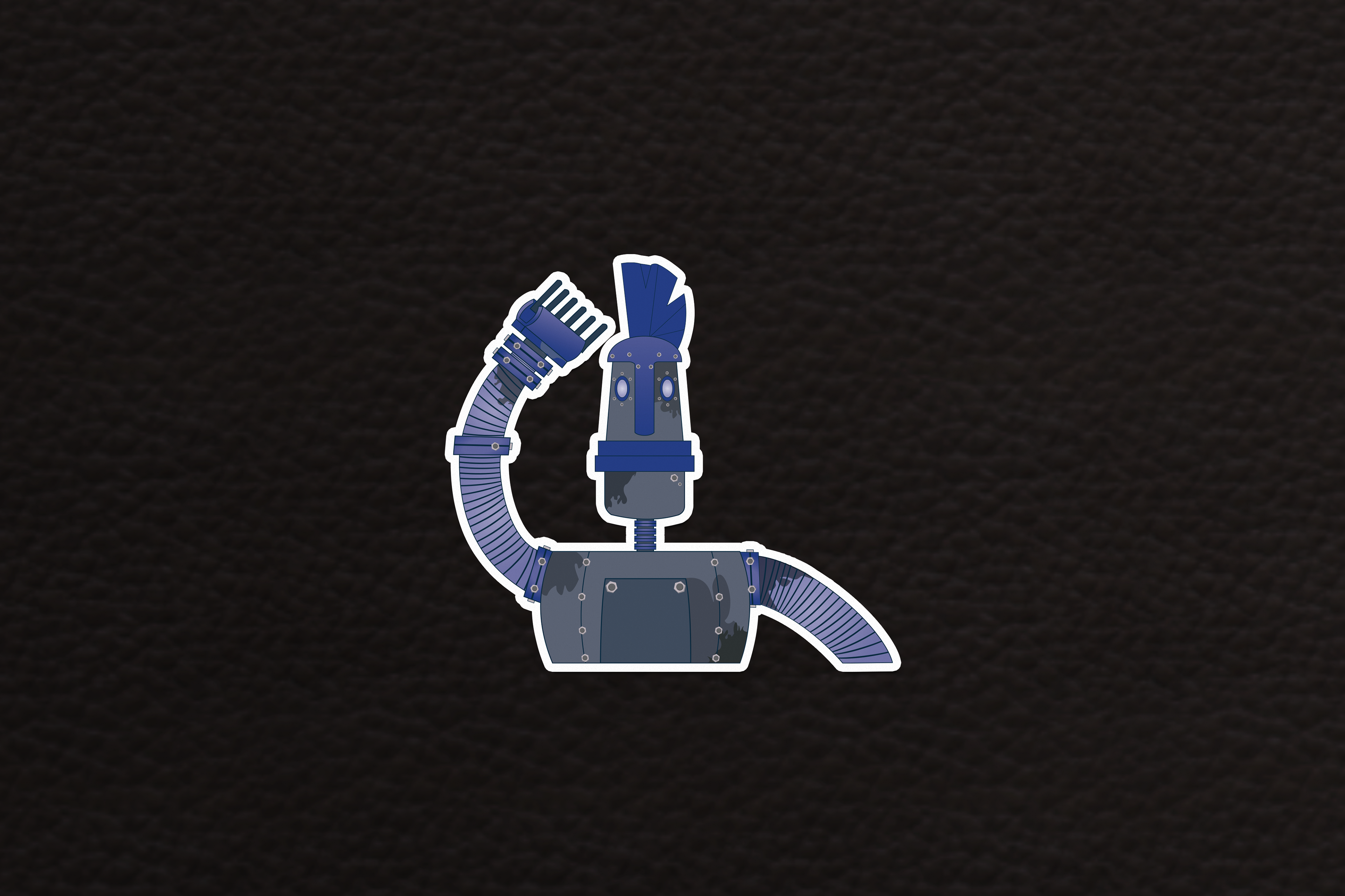
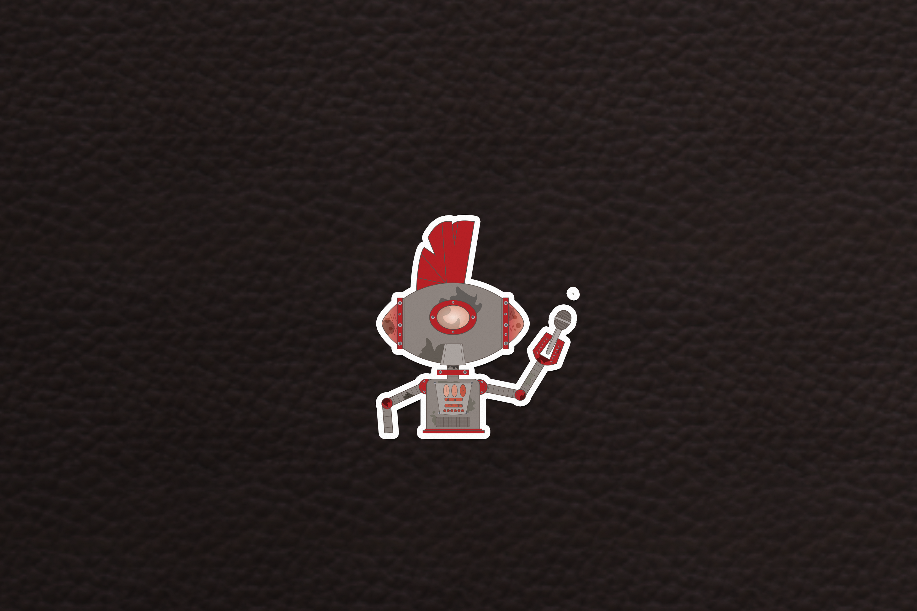
The brand and product were designed with a focus on the non-conformist punk culture, while also being tailored for a male audience. The small size of the box ensured that every detail remained in line with the brand's identity. Each box showcased a unique robot character, each sporting the same distinctive mohawk. This design choice allowed for a diverse range of characters while still retaining a cohesive theme. In contrast to traditional male products that rely on simple color variations and names for product differentiation, this product used a variety of robot designs and incorporated the color of the hair dye into the packaging. This innovative approach aimed to not only provide a visually diverse range of products but also to inspire customers to collect all the colors, creating a complete and captivating collection.
