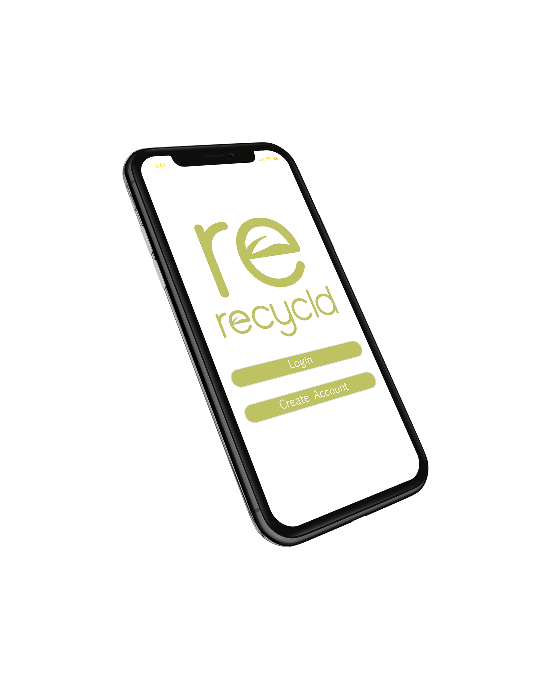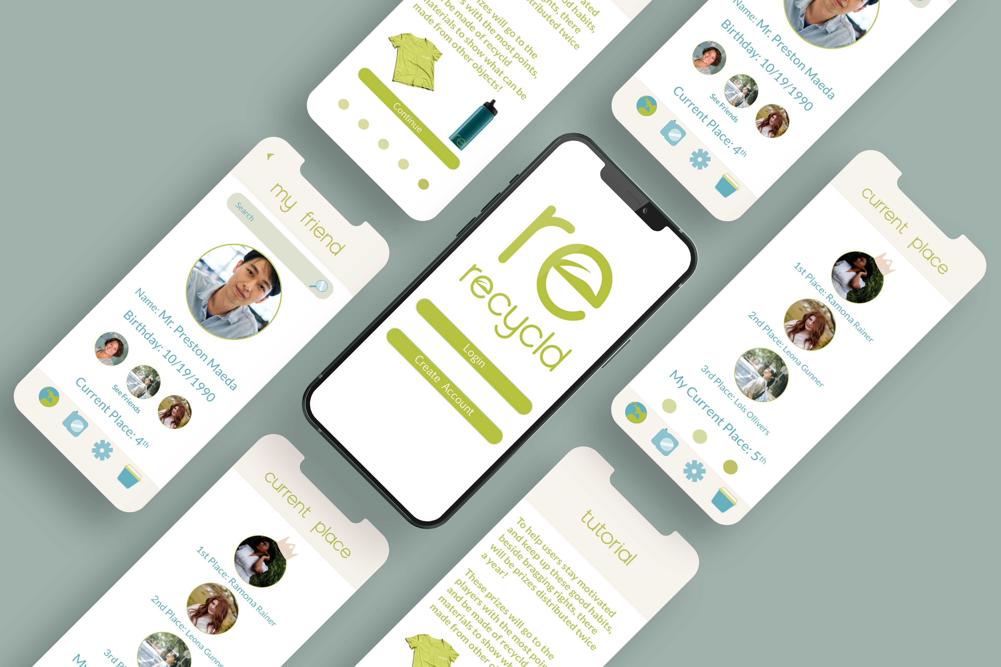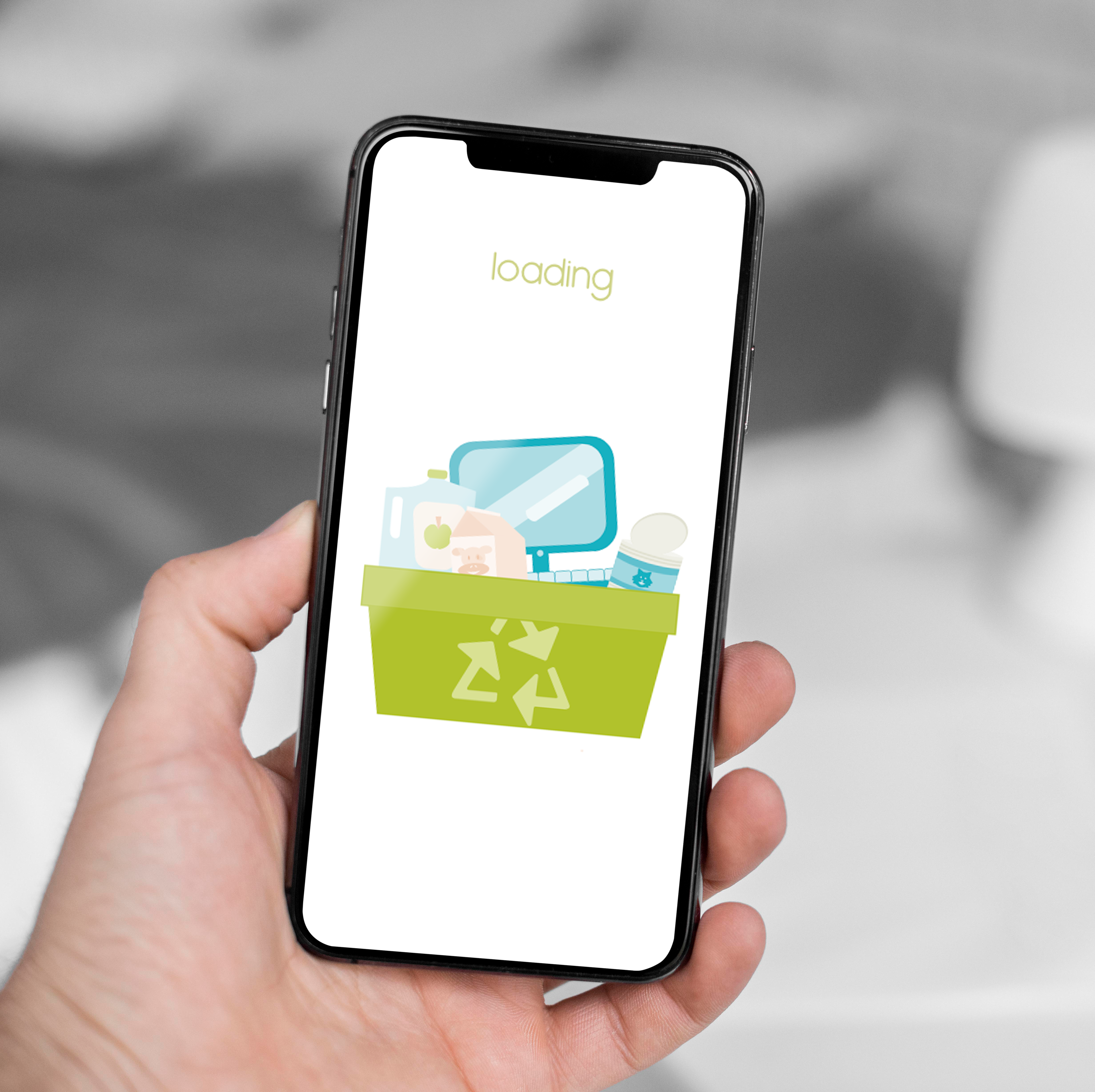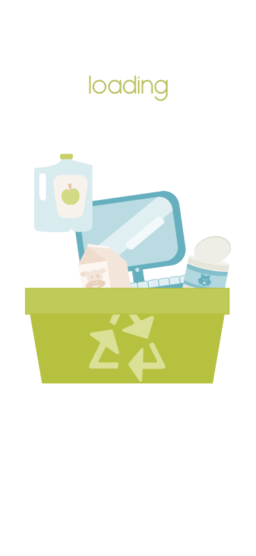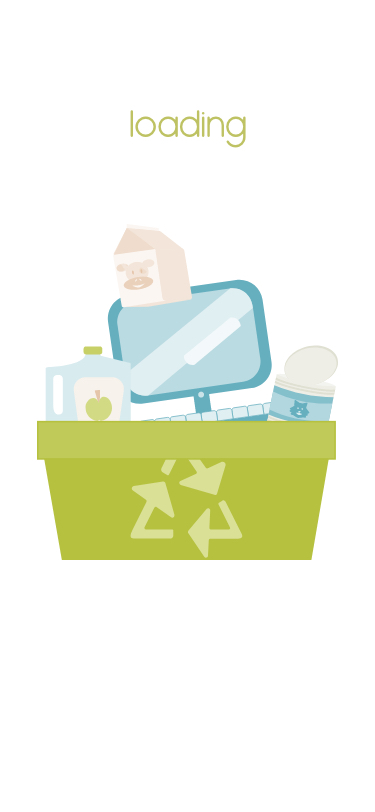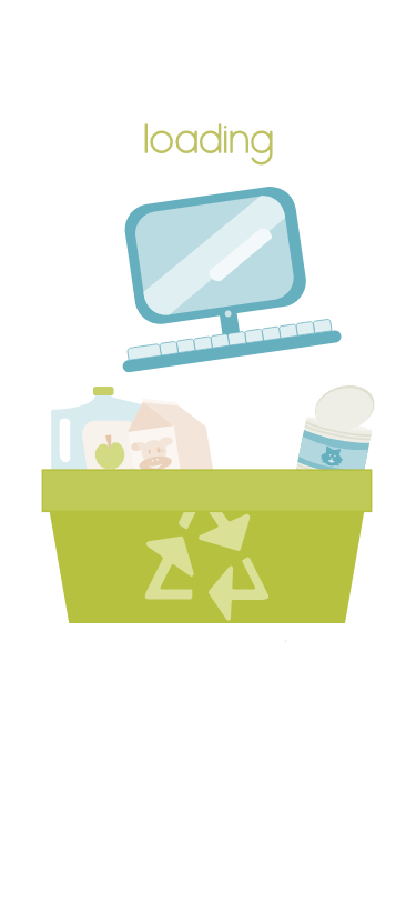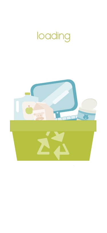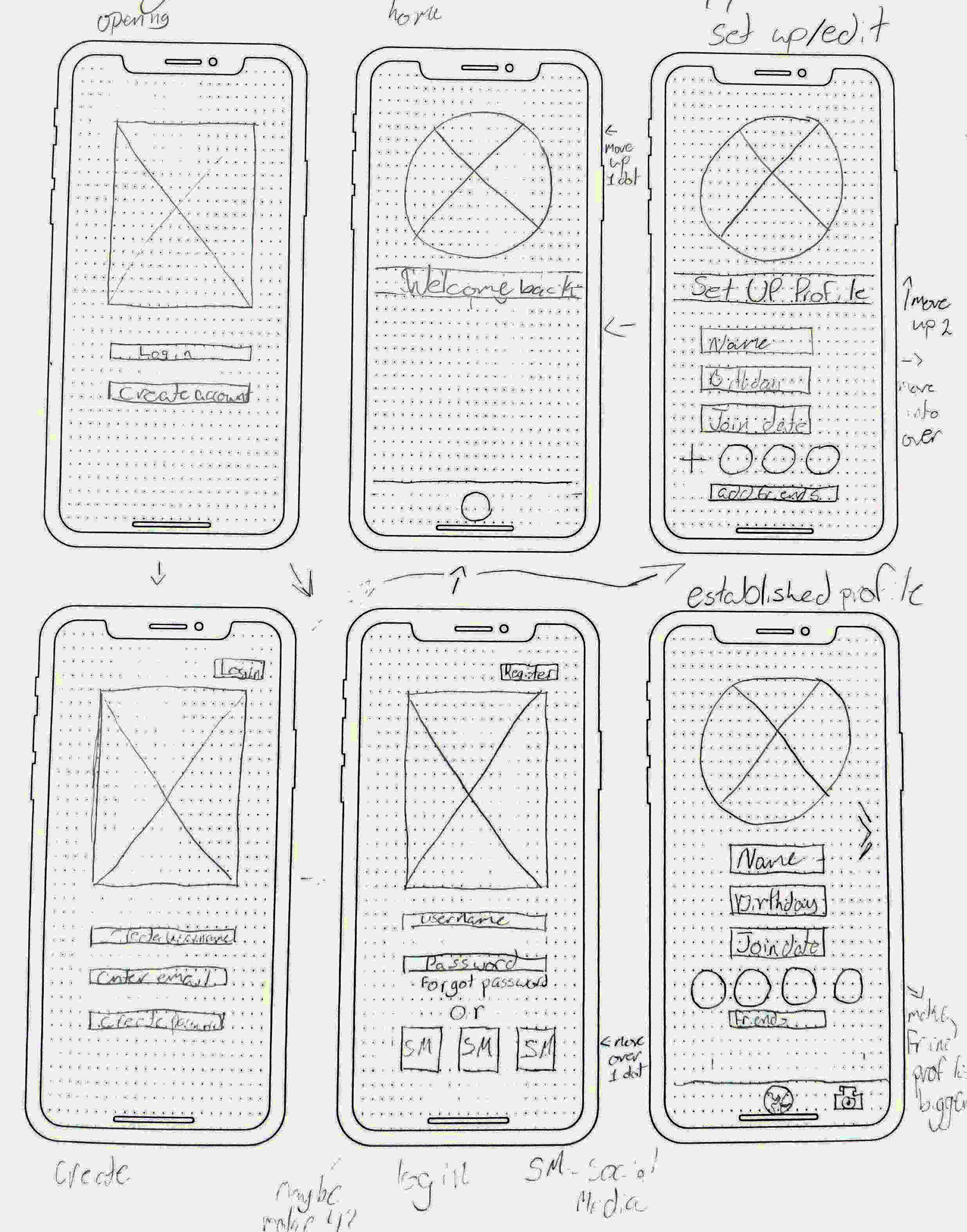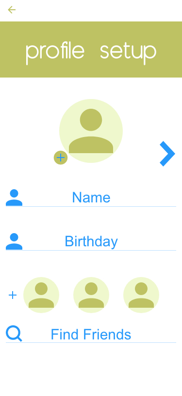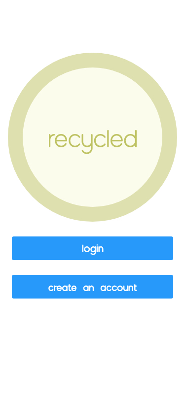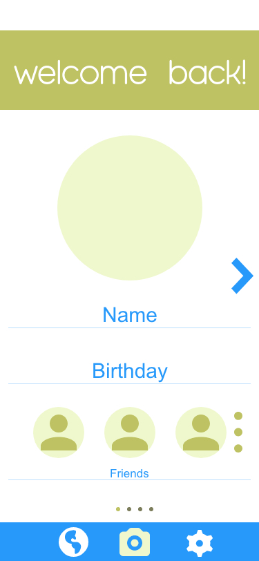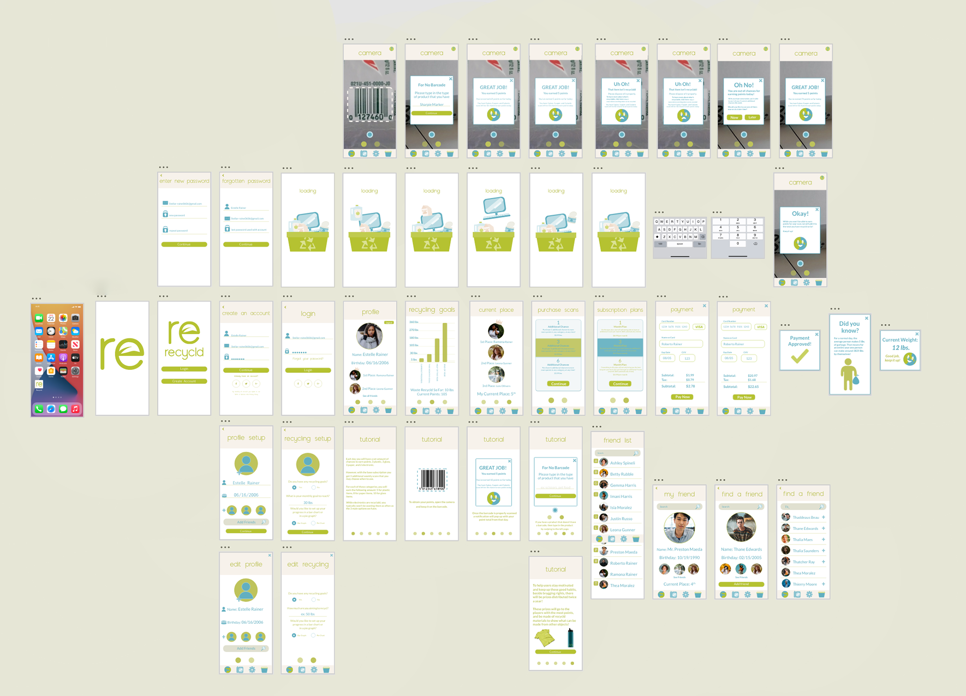
The interface of the RECYCLD app is characterized by a sleek, modern design that incorporates an environmentally conscious theme. This unique design approach is evident in the app's overall look and feel. By creating specific app personas, we were able to ensure that the app resonates with a diverse user base and remains relevant across different age groups. In our quest to find compelling iconography, we delved into the realm of eco-friendly aesthetics, infusing a playful element to give the app a distinct and memorable brand identity. Crafting additional screens for the app required a meticulous attention to detail in order to maintain a cohesive visual experience. We also integrated an interactive scanning feature to raise users' awareness about their recycling habits and progress. This interactive approach empowers users to actively engage with the app and take charge of their environmental impact.